

The Carillon Yearbook 2015-2016 Theme Pages
Last year we took photos for our divisions that blew people away. How can we top that this year?
Last year we took photos for our divisions that blew people away. How can we top that this year?
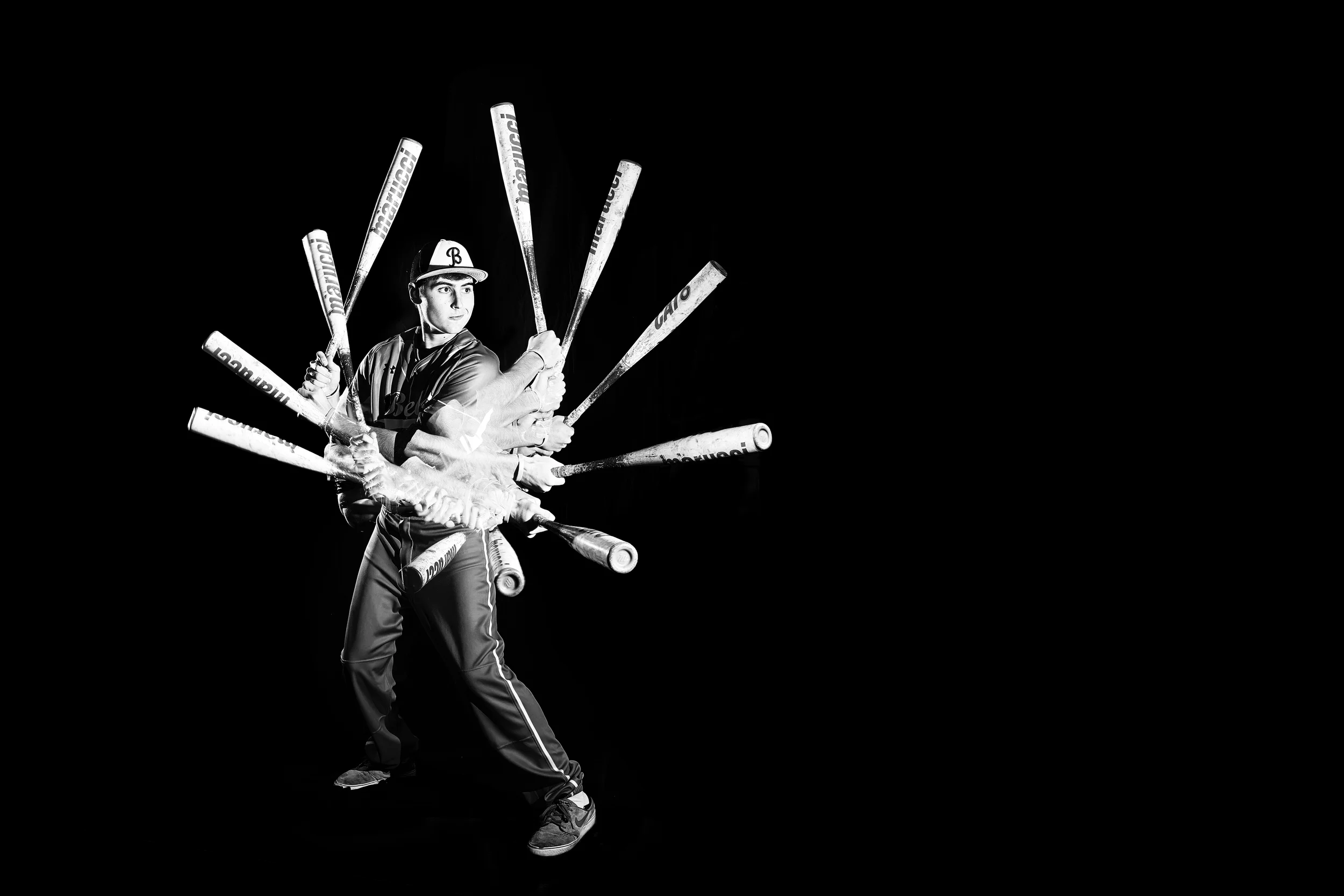
Antonio Garcia '16 shot for The Carillon Yearbook's 2015-2016 athletic division.
The Problem
The interrupter spreads for the 2014-2015 Carillon Yearbook were one of the most lauded parts of the book. We knew going into this year that we wanted a similar layout: one person to represent each division with a special effect that helped convey our book's theme. Our theme was centered on journeys taken with our design style guide emphasizing long lines and circles, curves, and connected points.
The Solution
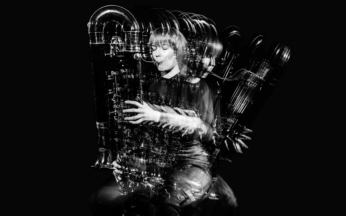
Portraits from BOND Creative Agency's Helsinki Philharmonic Orchestra rebrand serves as primary inspiration for this year's interrupter spreads.
We looked online for inspiration, eventually settling on the work of BOND Creative Agency and their rebrand of the Helsinki Philharmonic Orchestra. The portraits specifically hit several important points for us. They let us choose a single person for each division, the exact format we were looking for, they had the fluid curve design element found throughout our book without the need for actual lines, and they allowed us to use props and an action to naturally give context to each person's connection with the yearbook section.
Shooting

The shooting setup for interrupters. Two flash guns, one black backdrop, three Pocket Wizards.
Portraits were accomplished with two flashes connected by Pocket Wizards to a Nikon D750 in front of a matte black cloth backdrop. One flash was positioned to the front right of the subject for the main light with another flash to the back left for a rim light to really separate the subject from the background. No diffusers or light modifiers were used to ensure the high contrast effect we wanted.
The most difficult part, besides post-processing, was shooting fast enough for each action to be fluid in the final result. We don't have quickly cycling strobes and our flashes have a cycle time of 2-3 seconds when shooting on manual 1/1 so I couldn't shoot quickly enough to get the 8-12 shots per movement I wanted. Instead, I approached each shoot either by having the subject repeat the action 5-6 times slowly or by having them move slightly and hold their position for each shot. Stationary props I shot separately without the subject in order to get the most effective lighting, they were then composited on top in post.
Post-Processing
I used Capture One 8 to edit each set of photos and Photoshop to composite. The process was straightforward if not time consuming. Key points were to keep a nature exposure for the skin, the face especially, while increasing clarity and contrast. Finding a good level to bring out texture in the clothes was also important.
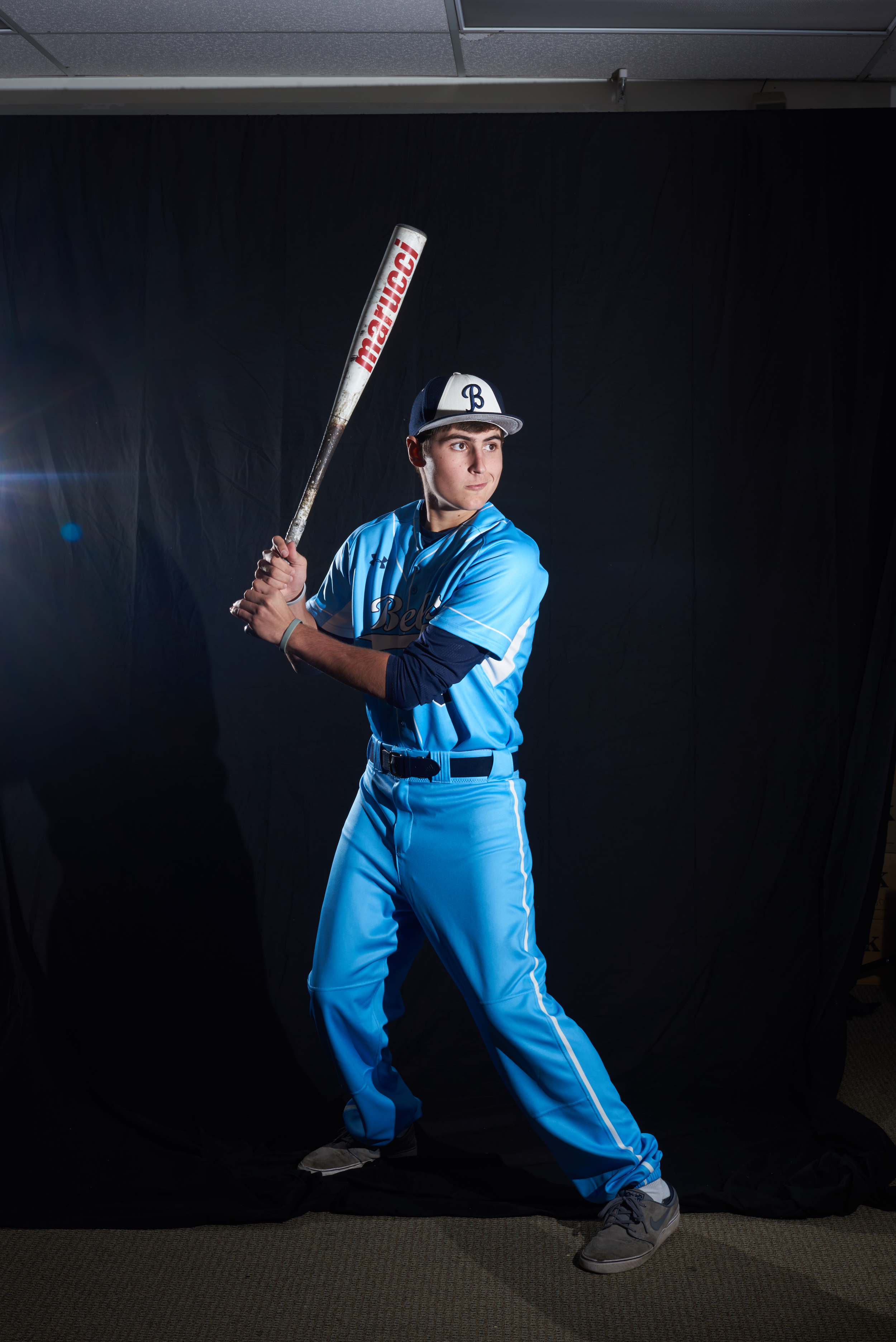
Shot straight from camera. 50mm f/14 1/125 ISO100
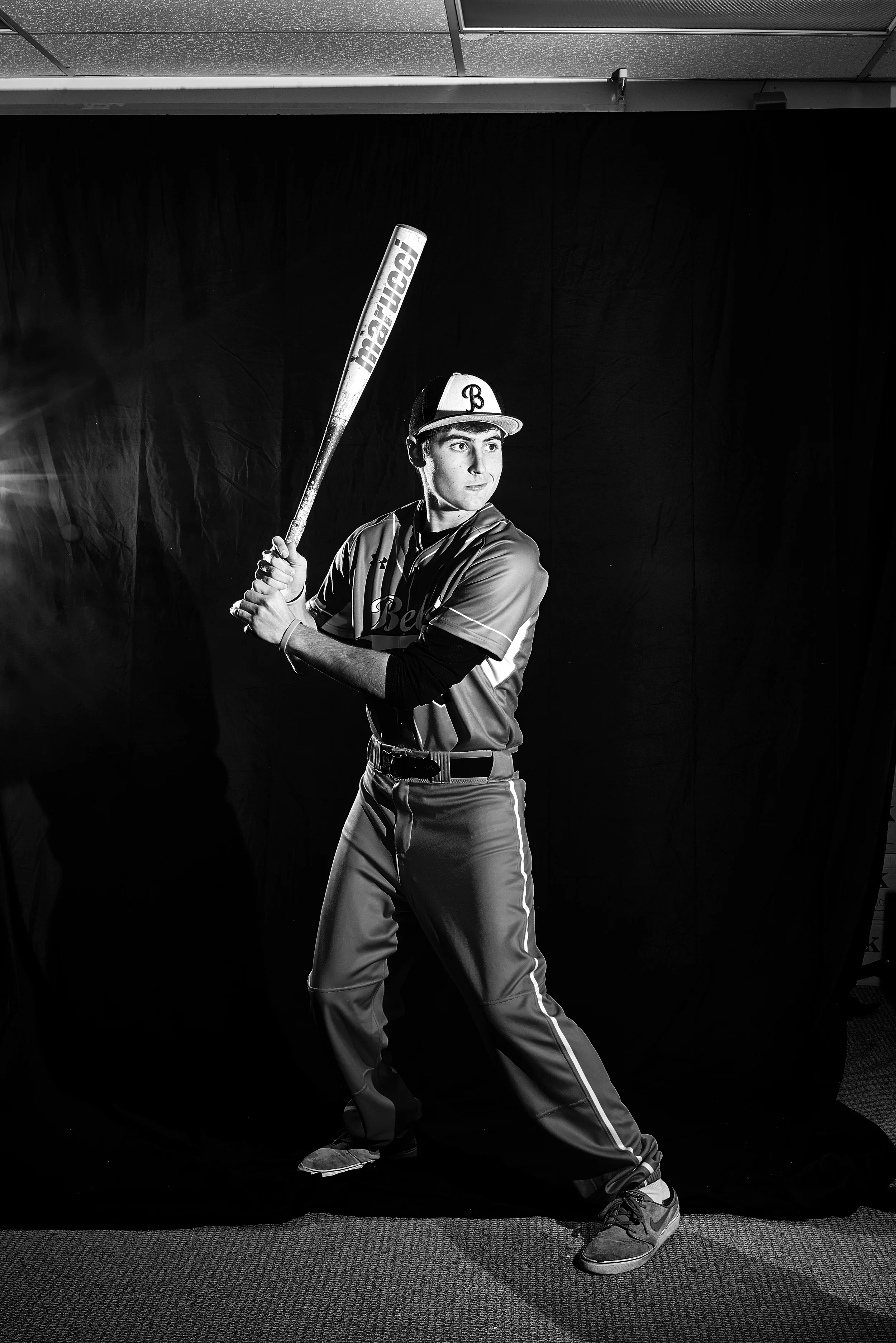
After post-processing in Capture One

Main changes made to the photos in Capture One 8. Increasing clarity and contrast to bring out texture was essential.
Each photo was brought into Photoshop to composite. I later found that using Photoshop's auto-align feature helped give a better place to start in positioning each photo. The blending option "Lighten" was chosen for each photo so only positive light values would show up giving a good overlap effect. Then each photo was cut out separately using layer masks, props shot separately were composited on, and final levels adjustments were made.
Here's a time-lapse to help illustrate the full post-processing process. Each photo took two hours more or less. For compositing I also used a Wacom Intuous Medium and Large to help create layer masks.

Example of what a finished composite's layers would look like.
The Results
The resulting photos were striking and flexible enough for placement on spreads. We effectively conveyed our theme while stretching ourselves out of the design guidelines we set.
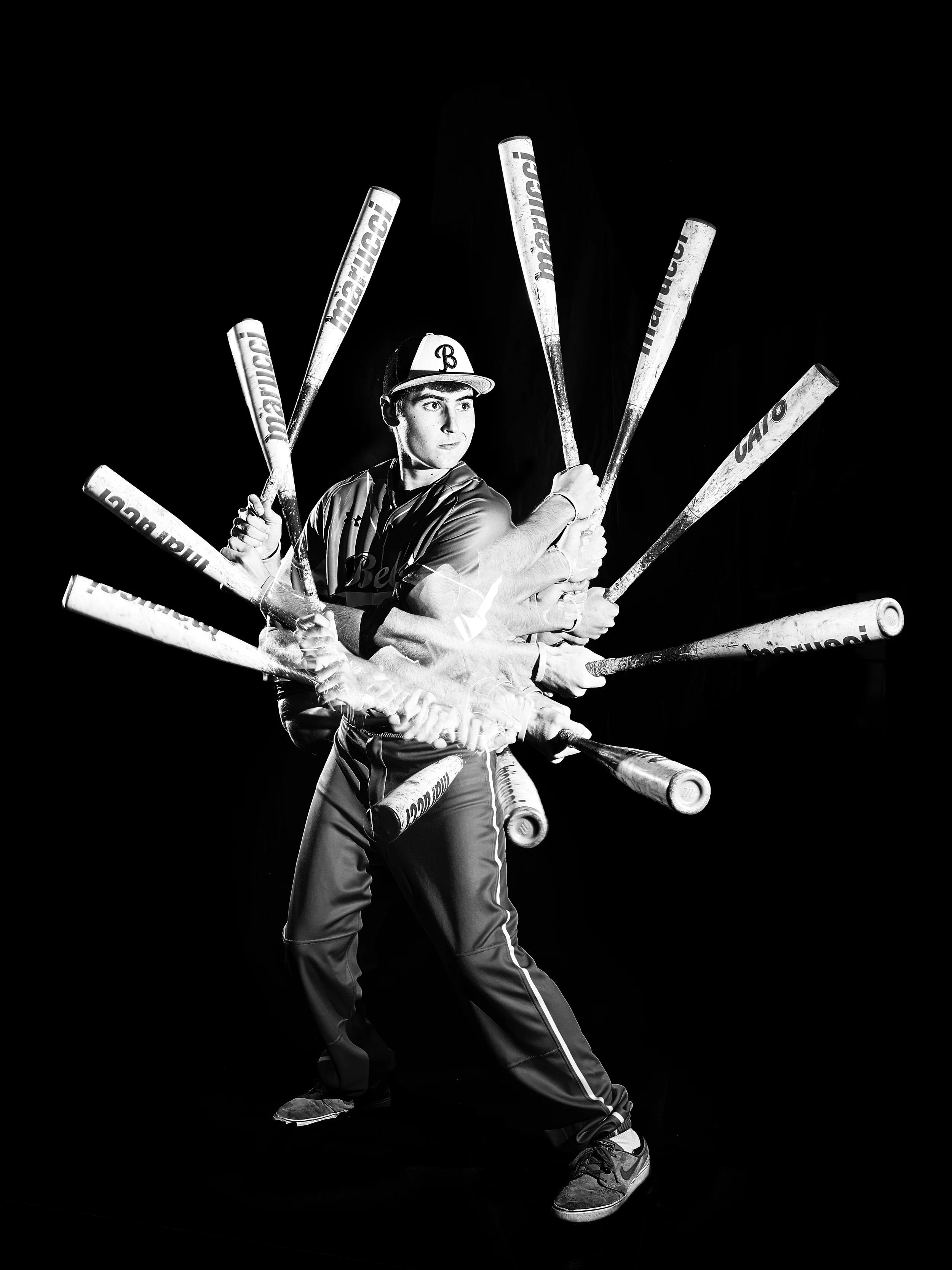
"Athletics", one of six divisions shot for the 2015-2016 Carillon Yearbook.
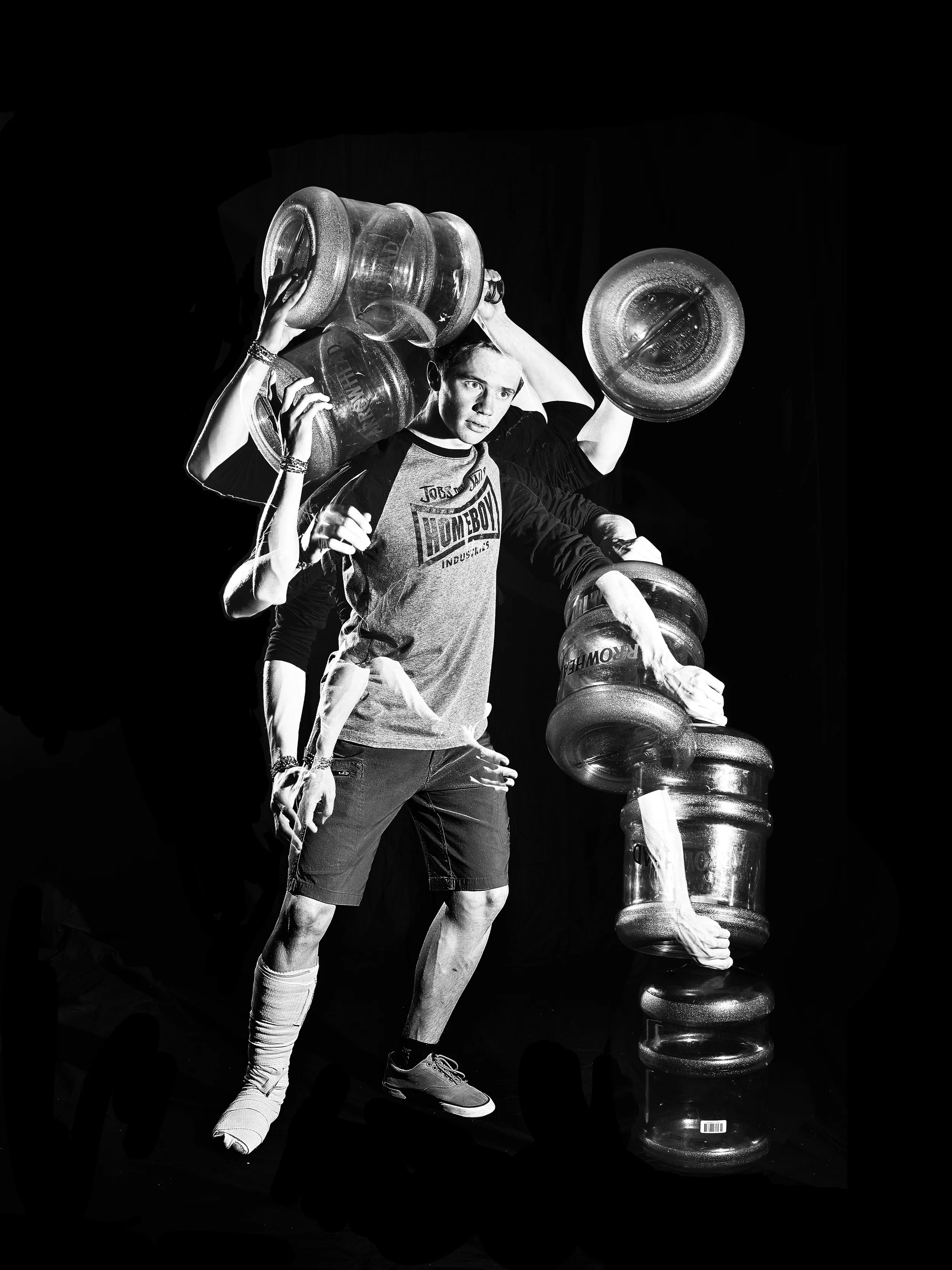
"Clubs & Organizations", one of six divisions shot for the 2015-2016 Carillon Yearbook.
Shooting Dances: The Photo Booth
How do you make teenagers want to participate in a photo booth while keeping photographer effort at a minimum? Answer: You copy the photographer of their favorite celebrities.
How do you make teenagers want to participate in a photo booth while keeping photographer effort at a minimum? Answer: You copy the photographer of their favorite celebrities.

Students in a photo booth at a school dance. Implementation of a photo booth has greatly increased online photo sales and become an essential part of the school dance experience. © The Carillon
Historically, one of the most popular features of our mixer photography has been the photo booth. These photos sell well on Zenfolio, are posted frequently on social media with our watermark, and are very efficient to take effort-wise. Under ideal circumstances you can set up the backdrop and flashes correctly at the beginning of the dance and just focus on taking the shots for the rest of the dance.
The Inspiration

Terry Richardson directing a photoshoot. Notice the speedlight attached slightly off lens.
Our booth photos are inspired by photographer Terry Richardson. His setup is a plain white backdrop with an offset speedlight to get high contrast shadows and blown out highlights. Richardson poses his subjects more candidly than typical portrait photographer, using props and unconventional posing directions to achieve this look.

Lana del Rey shot by Terry Richardson for T magazine

Barack Obama shot by Terry Richardson

Kendrick Lamar shot by Terry Richardson for Document magazine
The Execution
Because we're shooting in a large dark room and are shooting more than one person we have to make a modification to Richardson's one speedlight setup. Our normal setup requires:
- 2 light stands
- 2 strobes
- 3 Pocket Wizards
- 1 matte white backdrop
- 1 camera
First the white backdrop is set up against a wall. Both strobes are set on light stands 10-15 feet from the backdrop at roughly 35º angles to the center of the backdrop where subjects will be standing. When the trigger on the camera is pushed, one Pocket Wizard attached to the camera's hotshoe will send a signal by radio to the Pocket Wizards attached and plugged into each strobe. The strobes will fire when a signal from their respective Pocket Wizard says that the camera's trigger was pressed.
The Result
Even with improper set ups we can good replication of Richardson's style, regardless an attractive setup for photobooth shots and consistent. Post-processing is absolutely essential for these photos, slight over-exposure and correct white balance make or break these because the large white backdrop makes these features more prominent than in a normal portrait.
What we get is a fun and consistent type of shot that eschews the traditional photo booth in favor of a more modern shot that takes its cues from fashion and celebrity magazines. Teenagers are on social media to stand out and you give them a picture that looks different. These have a high rate of success being purchased or posted with an organization watermark and require minimal work after setup making them a perfect extension of traditional school dance photography.

© The Carillon

© The Carillon
The Carillon Yearbook 2014-2015 Theme Pages
We needed a fun and eye-catching way to express the individual while also representing each section of the book in a more general way. We started by looking for some inspiration.
For the 2014-2015 Carillon Yearbook we took on an ambitious challenge for our theme pages.

Foster Westover '16 in the Student Life Division Spread for The Carillon 2014-2015 yearbook.
The Problem
Last year we were faced with the problem of what to do for interrupter spreads for the yearbook. We needed a fun and eye-catching way to express the individual while also representing each section of the book in a more general way. We started by looking for some inspiration.
The Solution
One image stuck with us by Toni López and Zara Castellanos from Barcelona, Spain who made a series of posters in 2014. In order to make it our own we looked at popular events like color runs and Holi, eventually deciding to give each interrupter its own color. This also worked well with our year's design rules giving colored elements within each section specific to the section.

The original photo that inspired the interrupter. by Toni López and Zara Castellanos
Shooting
Using two strobes with soft boxes and a dark gray backdrop we shot our opening spread photo first. We ended up scrapping the strobes and using overhead florescent lights instead because they already diffused very nicely. Additionally, we used an air compressor with a home made compressed air gun made out of PVC and pipe fittings to launch the powder.

The edited opening spread image. Note the tissue flying by the model's left arm used to create pressure in the compressed air gun. 85 mm, ƒ/3.5 1/800 ISO6400
The most difficult part of the process was getting the powder from the hand clap to spread in an appealing way. That came down to plenty of trial and error.
The next step was organizing the interrupters. That meant first choosing representatives from each division, then figuring out their pose and props to make their section clear. Actual shoots were using backdrops outside in shaded areas to keep the light diffused nicely.
Editing
Because of both how inconsistent the compressed air gun fired powder and how little of a cloud I was able to get I ran into problems quickly. I just wasn't getting the big bold cloud we wanted bouncing off the model's shoulders. To remedy this I took over a hundred shots for each shoot both firing the air gun and throwing powder by hand and I composited them in Adobe Photoshop after adjusting levels in Adobe Lightroom.
To help show what this process was like here is a sped up version of one of the five shoot composites.
The Results

One of five divisions shot for the 2014-2015 Carillon Yearbook. Student Life. 50mm, ƒ/5.6 1/1600 ISO1250

One of five divisions shot for the 2014-2015 Carillon Yearbook. Athletics. 85mm, ƒ/4 1/2000 ISO200
This book was an absolute blast to make and I can't wait until release day the 11th of September. Hope you enjoy it!